Society's Future:
A UI concept for a mobile simulation game about climate science


This project was an idea I had floating around in my head for a while. The concept is highly influenced by the mobile game Plague Inc. by Ndemic Creations. The main question that drove this idea was, how can we create an outlet for people to explore and come to their own conclusions about climate science while having fun?
So I started playing with the idea of a simulation game with the purpose to not only teach people about climate science but also about the human factor in climate science.
Here is a video of the prototype outlined above to preview what it looks like. Further details are below.
The link below will take you to a different page where you can interact with prototypes and explore the work in progress UI have I have created thus far. It is difficult to simulate the functionality of a fully interactive game in Figma so some of the mechanics are simply visual mockups of how the game might function. It is also an interactive prototype but the "gameplay" is super streamlined to simply give an impression of how the game might function.
The Problem
Problem Statement: People need a simple, easy, and fun way to learn about climate science and current scientific models.
Who is it for: People who want to enjoy games and in particular like to simulate world environments.
What: Providing a fun and simple simulation of complex climate models. To provide a play-based environment to explore climate science.
Where: Digital (mobile app)
Why: To entertain and create a feeling of fun so people can learn about climate science with less of a classroom feel.
The Goals
The theoretical goal would be to make a fun and educational simulation game. In a 2 year span, the idea would be to have an app on the market and have the app featured in a science news site. The idea is that more time spent in the app would be beneficial to learning about climate science.
Competitive Research
I was unable to find any direct competitors exactly but there are a number of websites and apps that provide some interactive learning experiences. These provided interesting visualizations that I thought could be good inspiration.
National Geographic Map Maker
https://mapmaker.nationalgeographic.org/hGBQ57UFwqfZ8ypD5cjGDx/
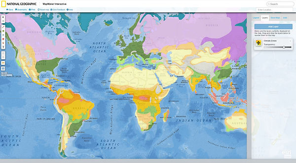
Likes
-
Different data can be overlayed on the map.
-
Different data types can be overlayed with each other for a basic comparison.
Dislikes
-
Visuals are static.
-
Interactivity limited to turning on and off the visuals.

A climate data site that graphs information from various sources and provides predictive curves.
Likes
-
Interactive graphs to explore data.
-
Different data types available
Dislikes
-
Options don't always work so getting a sense of how all data interacts is difficult.
-
Few explanations connected to each data type.
An interactive Map App of the earth created by NASA that shows how different types of data maps display on a globe...
https://play.google.com/store/apps/details?id=gov.nasa.jpl.earthnow.activity&hl=en_US
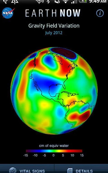
Likes
-
Different data types for visualizing.
-
Animated data with good clear labels.
Dislikes
-
Lacking context details on linked issues.
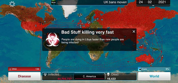
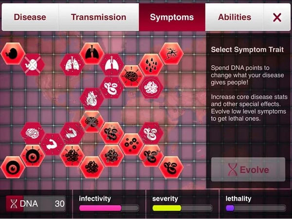
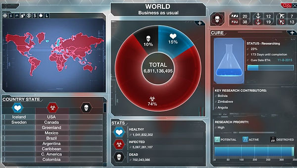
And of course as mentioned previously, the mobile game Plague Inc.
https://play.google.com/store/apps/details?id=com.miniclip.plagueinc&hl=en_US
Likes
-
The menu setup is simple and provides a visual paired with a description.
-
I like the overview map system to keep track of the situation with more detailed information in other menus.
Dislikes
-
I'm not crazy about the menu button setups.
-
Some of the menus are kind of busy.
Basic user flow

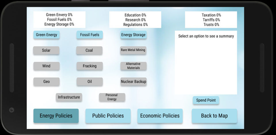
Wire Frames of Main Gameplay Screens


Captures of high fidelity prototypes
Some of the techniques being implemented to try to enhance learning are not only through the exploratory nature of the app but also from implementing dual processing learning by combining visuals with text to enhance understanding. Additionally, through providing further links for deeper learning and transparency of what data is used to create the models by which the game operates.
A constant color aesthetic was used to make the game feel consistent and understandable. Buttons have slight variations on the main page to indicate primary and secondary actions but the buttons themselves conform to a general consistent aesthetic.
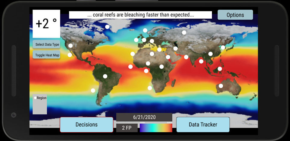
This menu underwent several reviews and looks different from the wireframes. The end result may still look different from this in the way the options are arranged and by exactly what each option is, but the general idea should stay the same. Options on the left are connected to a summary and explanation on the right.
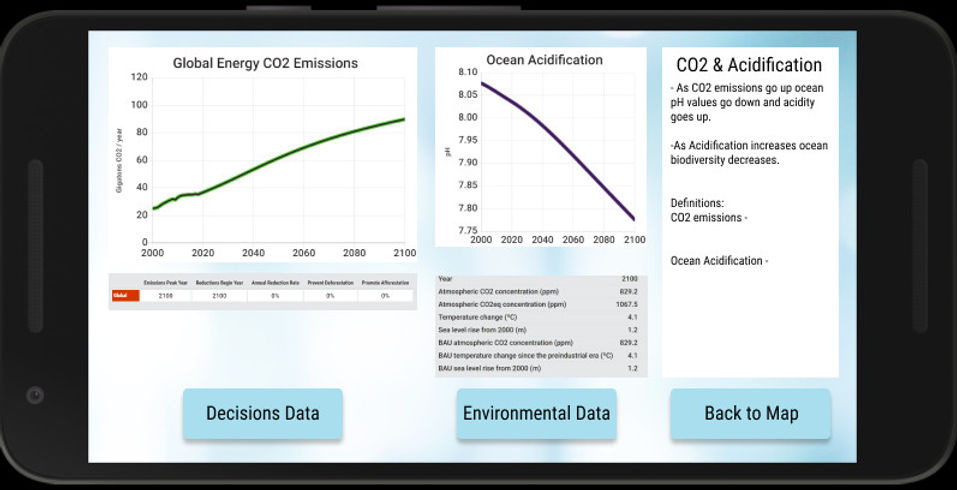
These data and graphs were borrowed directly from the researched website mentioned above. The color aesthetics of these graphs would change in the final product but the format of the graphs convey the feeling for what is intended. Data would be graphed, number values would be given, and a basic explanation would be provided to the right.